
The New Google Logo
At first, I loved the new Google logo. It has been long overdue for an update and I think in a lot of ways the new logo better represents the brand Google portrays elsewhere. But, something was off.
Each time I pulled up the search engine (which is often), I spent more time than usual staring at the doodle above the search bar. The next morning, I proclaimed “Ah-Ha!” over my breakfast cereal. I finally knew what was bothering me. The kerning.
For those of you that are not aware, kerning is the space between individual sets of letters. (This is not to be confused with tracking, which is the uniform space between all letters.) Kerning is an important part of design and can absolutely make or break logo designs. Bad kerning makes words at best “off” and at worst unreadable. Google’s new logo, for me, is in on the “just off” side of the spectrum. So, I couldn’t resist testing my theory by seeing what new kerning would do. So, I scraped the logo off the Google homepage and moved it over to Photoshop.
The new typeface, Product Sans, is a geometric sans-serif typeface, which draws on a long and fascinating history of typeface design, beginning in the 1920s. Geometric typefaces use simple shapes like circles, triangles and squares to determine the shapes and flows of letters. Geometric typefaces for me always evoke functionality, cleanliness and consistency. This is fairly different from the old Google logo typeface which was more whimsical and bookish. The logo’s animation to four evenly spaced dots follows along with the tone of the geometric typeface. Giving an even clearer feeling of symmetry and consistency.
The issue from my perspective is that the existing kerning is visually uneven making the “Goo” part feel drawn out and airy, while the “gle” part feels squished and rushed, constantly drawing my eye away from the beginning of the word. So, I measured the letters and spaces to get a better picture of what was going on.

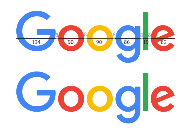
The New Google Logo, Measured
Any good designer will point out that simply measuring letters up and putting the same measured space between each letter is a bad idea. To demonstrate, I have averaged the space between the letters in the existing logo to 8 pixels and made the distance between all letters the same.
Google Logo with 8px Tracking
As you can see, despite the space being the same between every letter, it appears to be spaced differently. The problem is that kerning is about perceived space and not literal space. So that the space between letters with round edges (like between the Os) appears much larger than the space between two flat edges (like between the g and l).
Even spacing seems like it should be the kerning method of choice to go with the geometric font. But, with the way our eyes perceive space, what we really want is kerning that is perceived as even. To accomplish this, I began by making the spaces between all of the rounded letters the same (6 pixels). Then I made the space between the g and the l double the space of the rounded letters and added an extra few of pixels to deal with the smaller width of the g in comparison to the Os (15 pixels). Lastly, I spaced the l and the e 10 pixels apart as the flat and rounded edges make the space appear between the double-round spaces and the double-flat spaces.
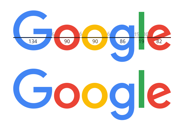
The New Google Logo with My Kerning Choices
The result, I think, appears more even and easy on the eyes. But, maybe it is just me. 🙂
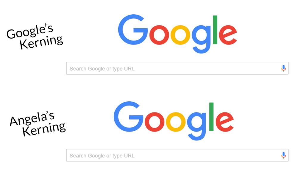
My and Google’s Kerning Compared
Update: There have been some interesting suggestions in the comments and elsewhere on social media (and in other unrelated space) about why Google made the typographical choices seen in the logo. Of these, most prominently, is the desire to appear playful and childlike. I see it. This appears in the slant of the e, the color choices, and the style of the animation. For, me the kerning is one step too far. As Tim Gunn might say to the Project Runway contestants, “You need to edit this there are too many ideas.” However, more strongly, I feel that the intensity of the childlike design grates against the realities of Google as a company—which generally I am a big fan of but—that involve some pretty weighty and adult issues involving privacy and user rights. I don’t want Google to be childlike. Fun, yes. Childlike, no. So, the design feels optimistically naive or pessimistically deceptive. When it comes down to it, design is subjective and tangled up in corporate interests, marketing plans, user perception, and the general milieu of its user base. So, there is no “right” way to make a logo, just ways that do better or worse jobs at conveying meaning and aesthetic. However, I wonder if playing with logo designs, especially of entities with such prominent (even if blackboxed) roles in our daily lives, we may encourage or incite discussions that might otherwise be lost. Can logo hacking (for lack of a better term) be a provocative space for discussion? Food for thought. (/Anthropologogizing)
1 Comment
This blogpost provides a fascinating exploration into the intricacies of the recently unveiled Google logo and the often-overlooked world of kerning. Delve into the meticulous details that shape the visual identity of this tech giant, understanding how precise letter spacing can make a world of difference. Whether you’re a design enthusiast or simply curious about the thought process behind iconic logos, this post is a journey into the art and science of kerning. Discover how the nuances of spacing can redefine a brand, and gain a newfound appreciation for the subtle details that elevate design to a whole new level.